Ideas reimagined
© 2024
uLékaře.cz
© 2024


Client
uLékaře.cz
Services
Rebranding
Graphic design
Year
2024
uLékaře.cz rolls out a fresh new design
uLékaře.cz is a go-to online platform connecting people with certified doctors for fast, reliable medical advice and consultations. It’s a modern, hassle-free way to get expert health info and connect with top healthcare professionals, all from your device.
As their company expanded, the team saw the opportunity to elevate their visual identity and reach a wider audience. They turned to us for a full refresh that modernizes their look while staying true to their core philosophy and values.
Rebranding & Graphic design & Rebranding & Graphic design &
For over a decade, uLékaře.cz has been defined by its bold turquoise and red color scheme and a logo that had grown outdated over time, no longer reflecting the company’s forward-thinking approach.
We set out to create a new logo that feels warm, bright, and inclusive, with a recognizable symbol representing unity and wholeness.
Clear, Inviting & Impactful
Given that uLékaře.cz provides all-in-one health advice, we focused on creating a design that’s simple yet powerful, representing their 360-degree care approach. The goal was to create a modern, approachable visual identity that communicates the full scope of their services in a way that feels intuitive and leaves a lasting impression.
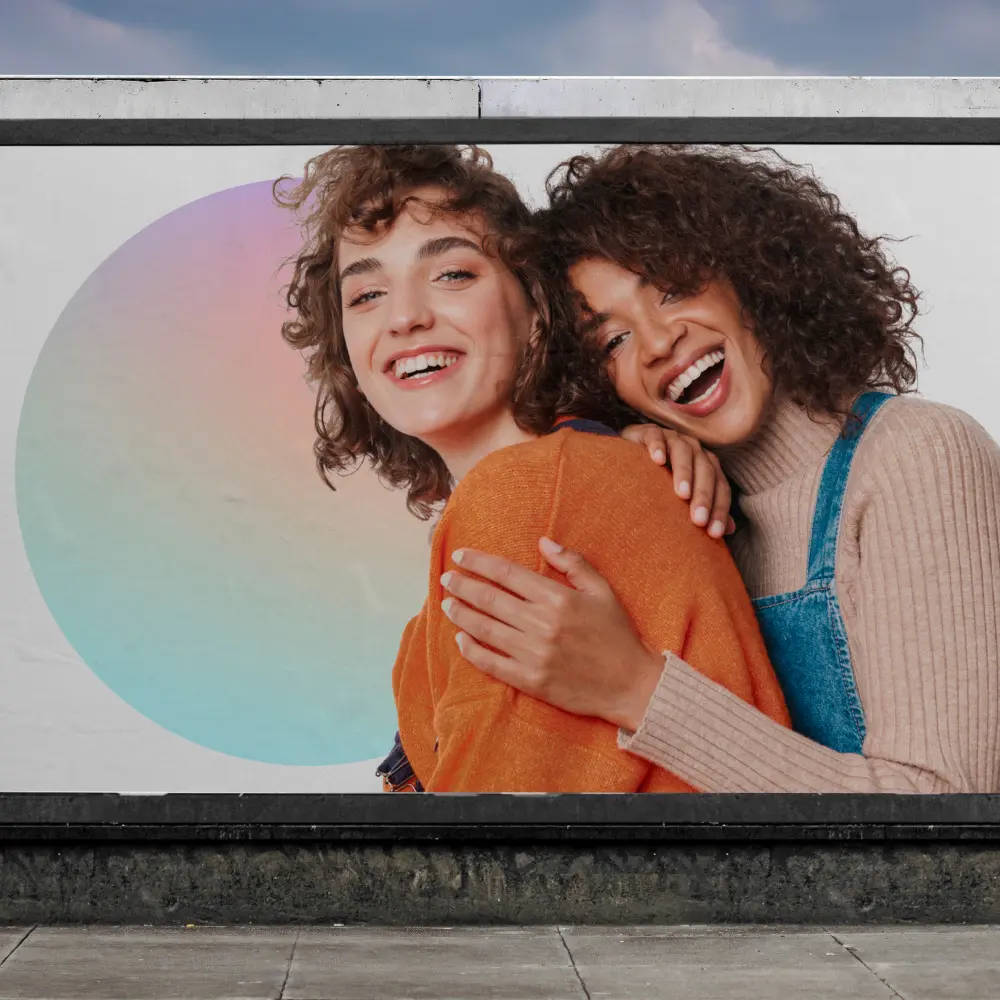
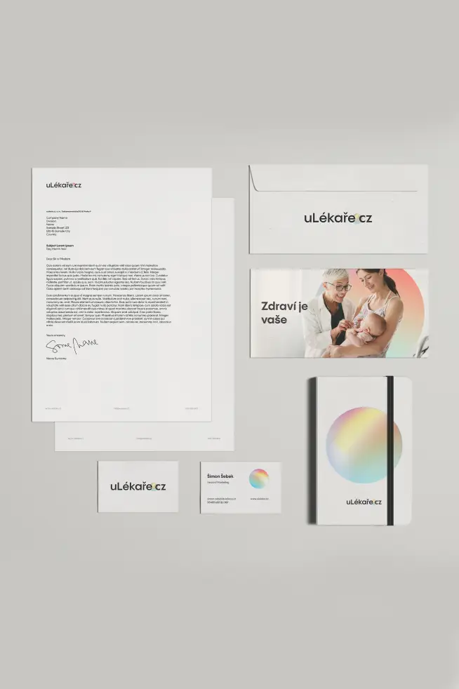
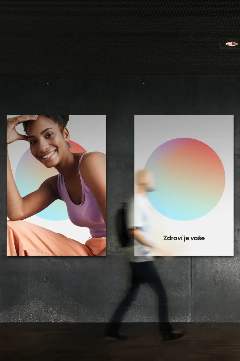
We developed a cohesive set of print and digital assets for uLékaře.cz, aligned with their new brand identity. Each touchpoint, from digital content to printed materials, was designed to create a consistent and polished look across all platforms.


The updated color schemes and brand elements bring uLékaře.cz's new energy to life, effectively showcasing their comprehensive services and engaging users across both online and offline channels.


