Ideas reimagined
© 2024
Minus One
© 2024
Client
W Prague
Services
Branding
Product design
Graphic design
Year
2024
Iconic Revival
W Prague itself is an Iconic Revival, reawakening the legendary Grand Hotel Evropa with a new bold energy. Rooted in the spirit of Art Nouveau and inspired by Mucha’s dreamlike worlds, the hotel is a surreal escape where art and design flow through 161 suites and guest rooms, as well as multiple unforgettable dining and cocktail outlets. The Fantastical Garden adds another layer of wonder, an unexpected fusion of nature and imagination. A new highlight of Prague’s nightlife, Minus One introduces a creative, immersive take on high-end cocktails.
Project Overview
W Prague unveiled Minus One, a new cocktail experience on the hotel’s basement level. More than just a bar, it’s a collection of venues, each with its own aesthetic, atmosphere, and cocktail identity. Commissioned to shape the Minus One brand and experience, we created a visual and tactile world that spans both digital and physical touchpoints. The concept reflects W Hotels’ positioning as a leader in modern luxury while drawing from W Prague’s unique storytelling: a fusion of Mucha-inspired fantasy, the Fantastical Garden, and the allure of magical elixirs.
Branding & Product Design & Graphic Design & Branding & Product Design & Graphic Design &
Discover the Wonder
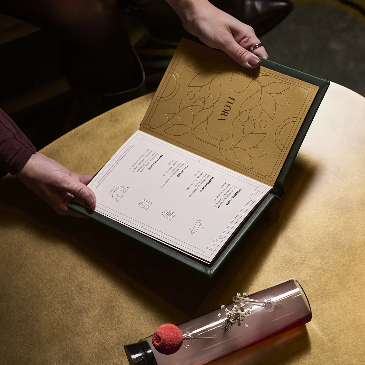
Concept Inspired by W Prague’s passion for storytelling, Minus One is an invitation into a world where past and present collide, layered with wonder, mystery, and the unexpected. Rooted in the Fantastical Garden narrative, Minus One imagines what unfolds after dark. Hidden beneath the city, its world comes alive through the creatures that call the garden home, each embodying the character and allure of the spaces they belong to. This backstory subtly ties together the venues, Poppy, Playroom, and Occulto, infusing each with its own distinct personality. The creatures don’t steal the spotlight; they set the tone. Whether dark and enigmatic, playful and inviting, or steeped in intrigue, they enhance the experience and align with the spaces’ signature elixir offerings.
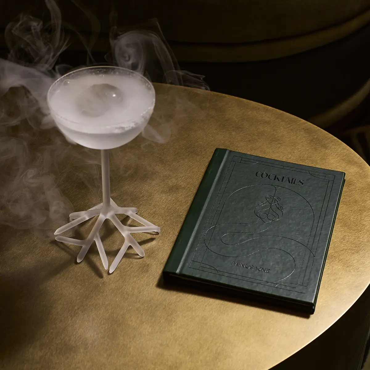
Graphic Elements Guided by W Prague’s Iconic Revival, the Minus One concept reinterprets the hotel’s original architecture with a sophisticated twist. Banisters, pillars, and ornate details are transformed into Art Deco-inspired frames, connecting Minus One’s design language with the hotel’s sense of depth, glamour, and nostalgia. These elements don’t just reference the past; they give Minus One a rich visual identity that feels both timeless and fresh.
MINUS ONE
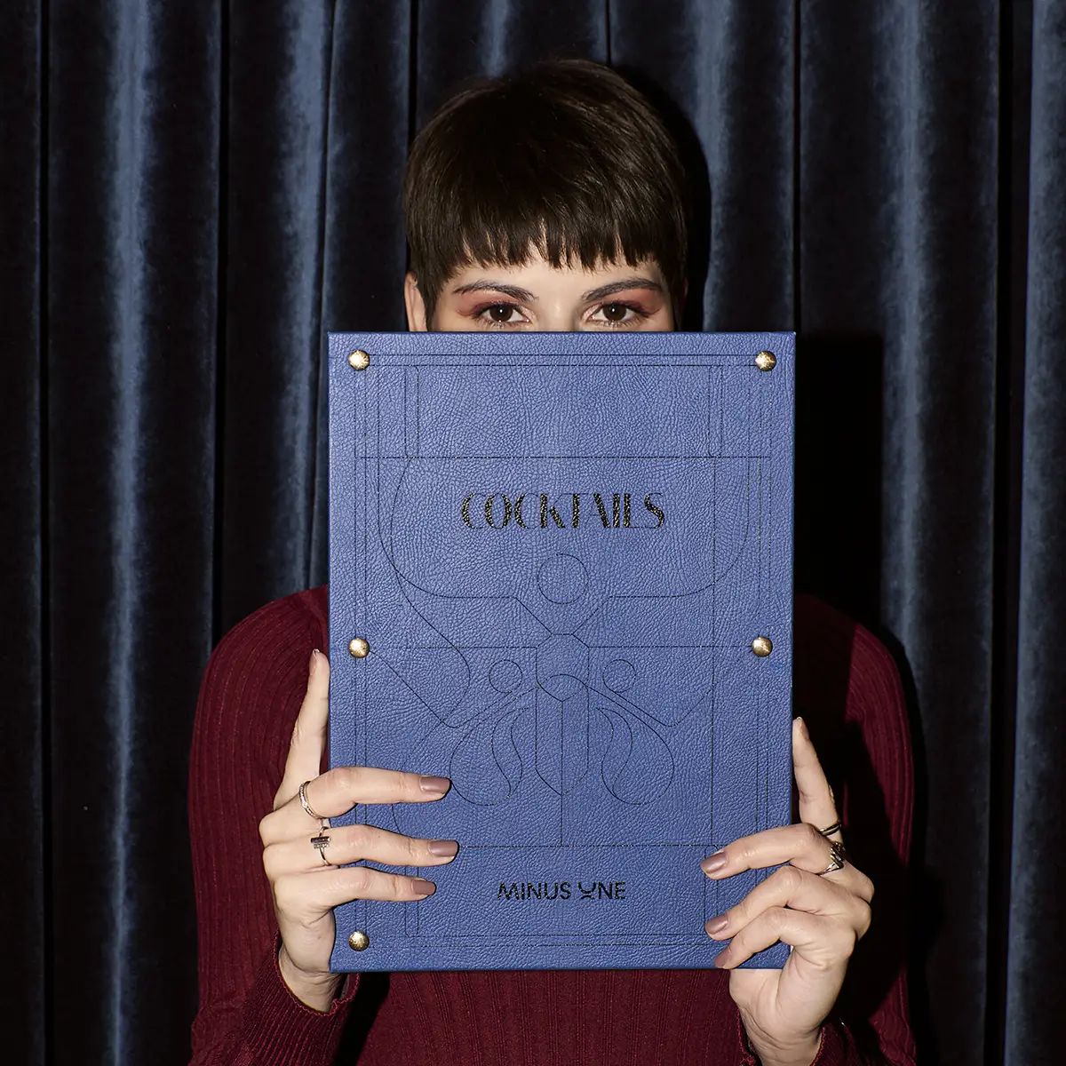
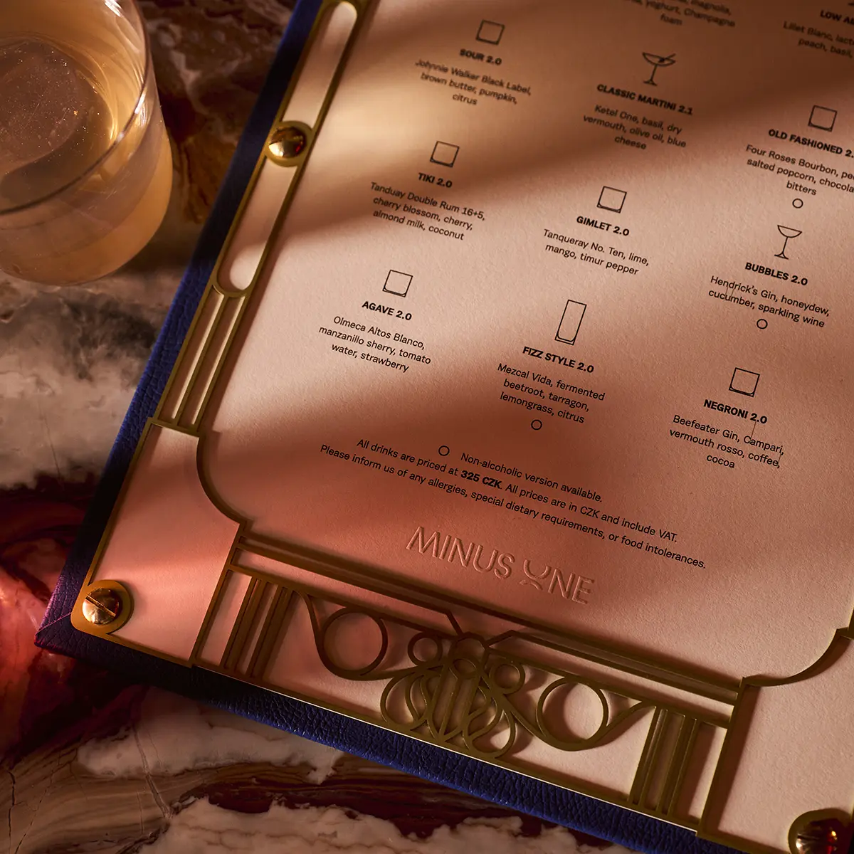
We designed the Minus One logo to be sleek and recognizable; bold enough to make a statement, yet still effortlessly glamorous. The logo isn’t just static. Designed with motion in mind, the Minus One symbol rotates upward in animations, mirroring an elevator’s descent. It’s subtle, clever, and made for digital impact. This movement brings the brand to life across social media, websites, and high-visibility video formats, from city lights to in-venue screens. The color palette. Black, Off-White, and Brass, with a vibrant Purple accent, balances sophistication with a refined, contemporary feel. It sets the tone on top of layered visuals and striking photography, amplifying the brand’s aesthetic.
OCCULTO
Occulto invites guests into a world of mystery, where the magic of past times is captured through enchanting concoctions. Cocktails are served from bespoke Art Deco-inspired punch bowls, as well as specially designed glasses that enhance both the drink and the experience. The snake, a symbol of transformation and mystery, embodies Occulto’s identity—compelling, alluring, and deeply immersive. More than just a creature of secrecy, it also represents vitality, renewal, and balance, reinforcing the depth and intrigue woven into Occulto’s experience. The green color palette not only reflects the venue’s decor, it is an obvious choice for it’s concept.
POPPY
As Poppy carries on long into the night, the moth becomes its perfect emblem. Drawn to light and steeped in symbolism, moths are often associated with mystery, transformation, and the unseen, perfectly complementing the world of alchemy and elixirs. They also represent rebirth and evolution, much like what Poppy stands for: new takes on signature cocktails. Drenched in deep blue, the space reflects both its namesake and the pulse of the night. Blue evokes a sense of mystery and magnetism – cool, refreshing, and endlessly alluring. It’s the color of moonlit shadows and electric energy, setting the stage for unforgettable encounters and perfectly mixed drinks.
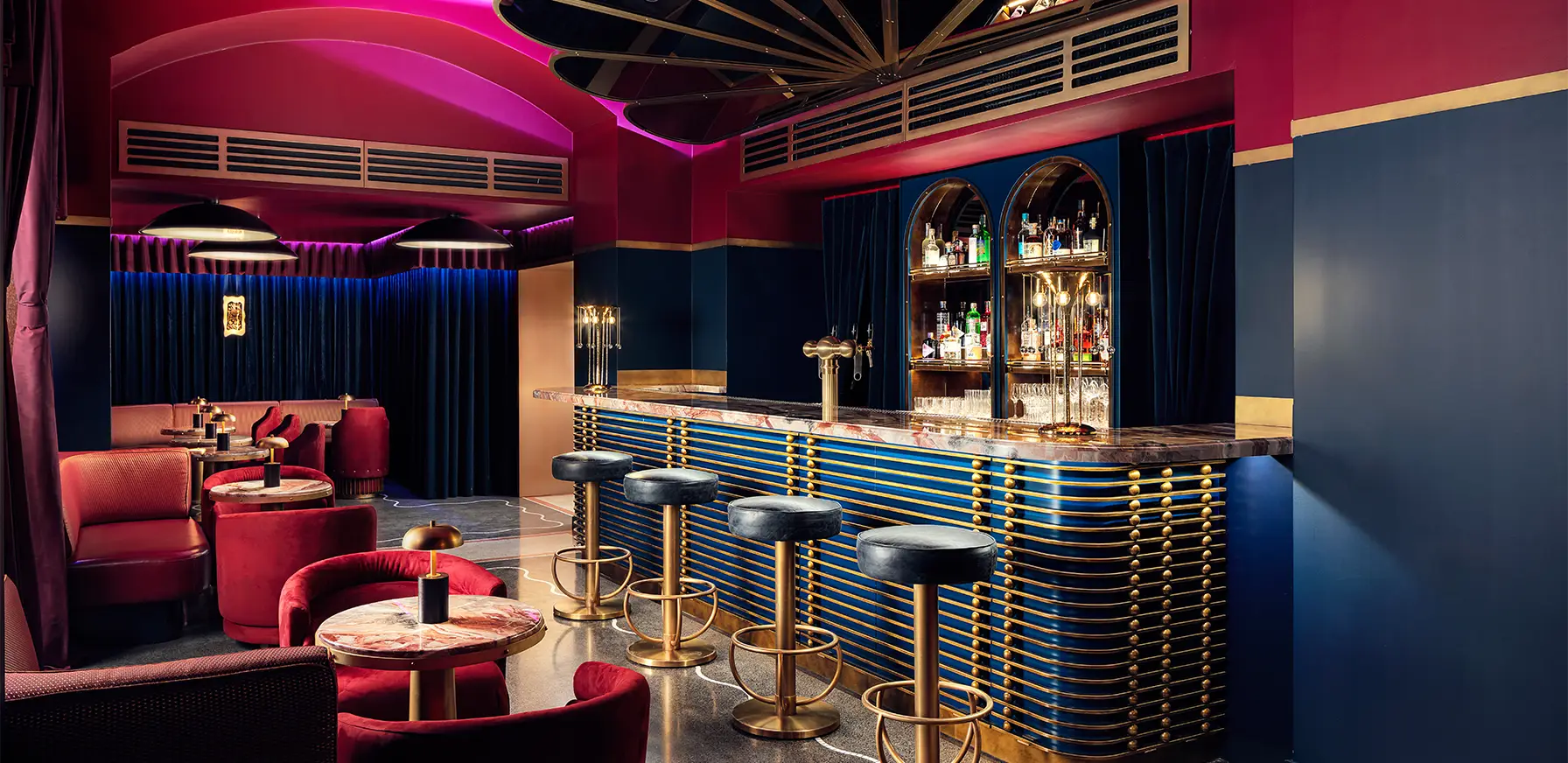
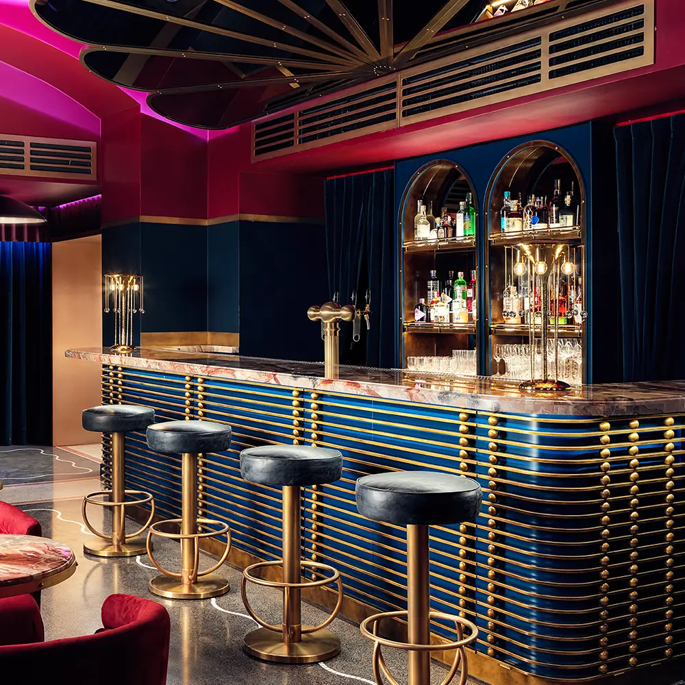
Playroom
A venue designed for spectacle, Playroom hosts an ever-changing lineup of events, from musical performances to cabarets and immersive experiences. It’s a space where the night unfolds unpredictably, filled with movement, rhythm, and undeniable energy. Playroom is embodied by the cat, an animal that is beguiling, flirtatious, and endlessly curious. Red defines Playroom’s identity, extending beyond its striking interior. A symbol of passion and desire, it exudes vitality, excitement, and momentum; it’s a invitation to revel in the moment.